Nuriq
NuriQ brings peace of mind by capturing your visit, summarizing with AI, and making it easy to share with loved ones.
Content Development

About NuriQ

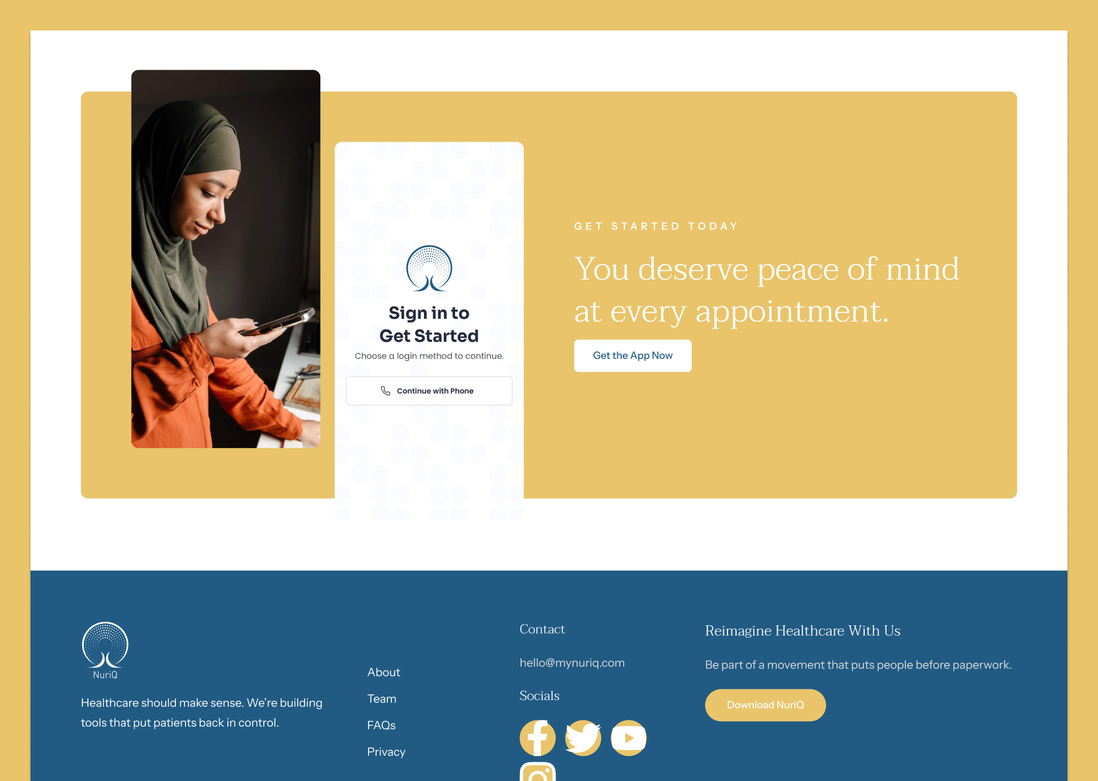
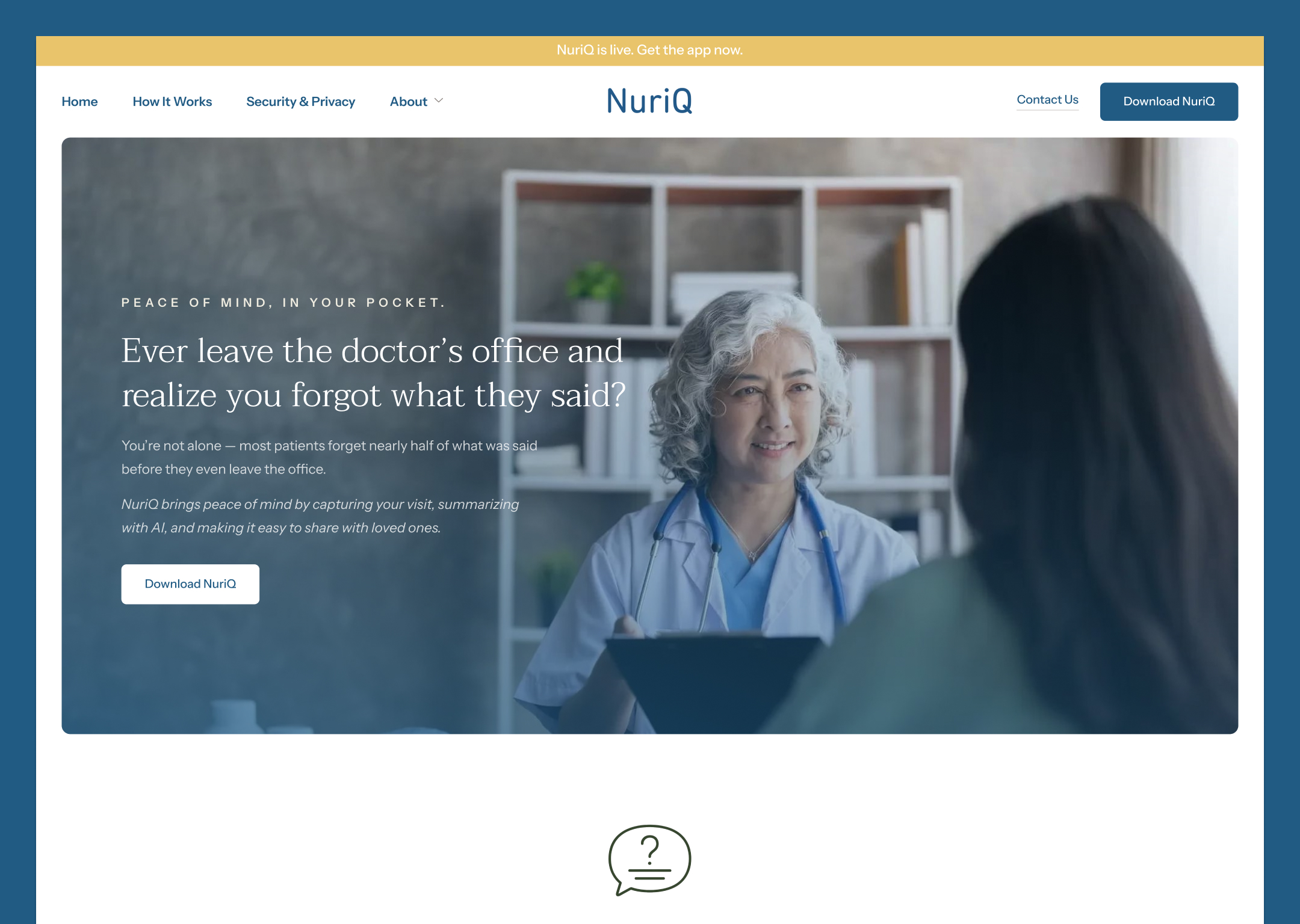
In the crowded health tech market, clarity is currency. Nuriq needed a high-impact website copy strategy that would allow the average user to understand the app’s benefits, overcome hesitation, and convert to a download in under two minutes. The goal was to translate complex health data into a simple, compelling narrative without relying on distracting design flair.

Client
NuriQ
Date
December 2, 2025

Project Objective

To create a high-impact website copy strategy for the Nuriq health and wellness app focused on specificity and clarity. The goal was to ensure the average target client could fully understand the app's benefits, address common concerns, and be motivated to download and use the app in less than two minutes of reading. This copy had to be an efficient, high-converting tool built upon a simple, non-distracting design framework.

No items found.

The Approach

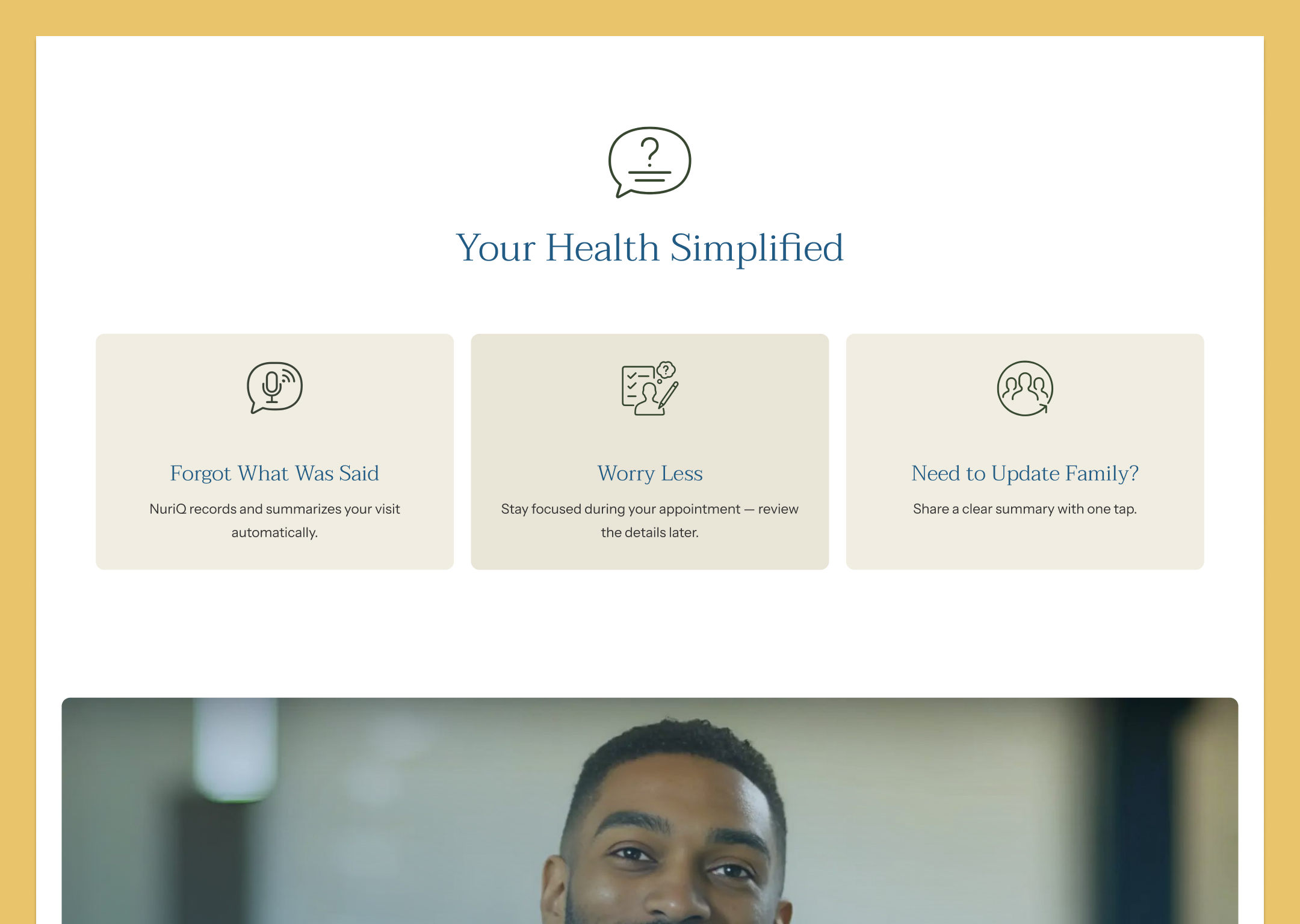
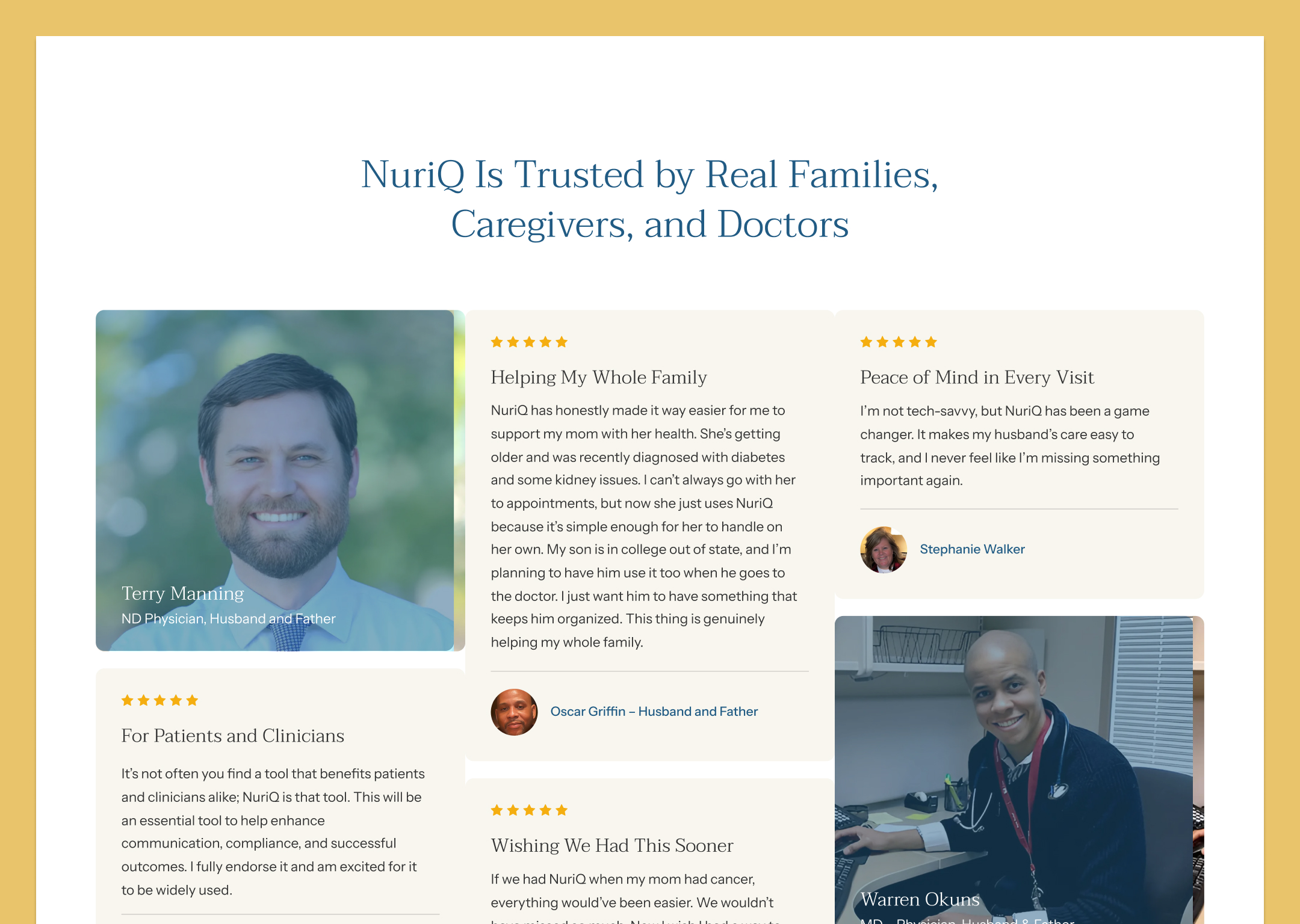
The approach centered on extreme content discipline, prioritizing user comprehension and action. We conducted deep Discovery and Research to precisely identify the needs and points of friction for the core target user, establishing a strategy where every word was supported by and reinforced the visual simplicity of the interface.


Content Development: Focused for Instant Comprehension

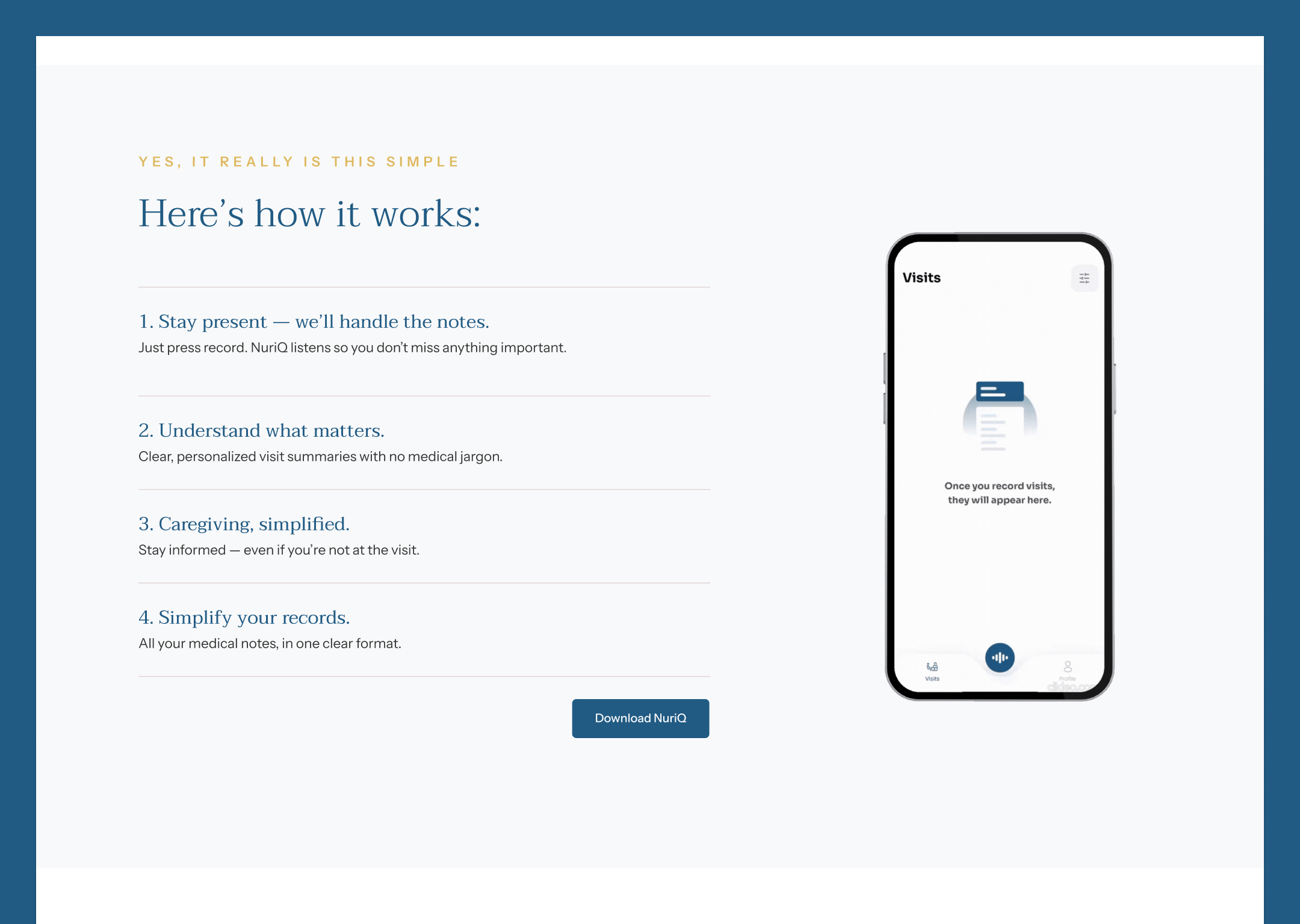
We restructured the entire copy to achieve the objective of immediate understanding and conversion.

  • Tone and Language: The tone was defined as Relatable, Compelling and Trustworthy, utilizing extremely basic language (e.g., "Your Health Simplified") to ensure quick absorption and to establish Nuriq as a clear solution.
  • Narrative and Trust: We integrated the Founder's personal connection (Dr. Khaleed) to the product, using copy that stated the direct connection of the App and the founder.  E.g The app was "built for our own families." This narrative choice built profound trust and authority into the minimal copy.
  • Value Proposition and Clarity: Copy was distilled into short, scannable steps like "Stay present, we’ll handle the notes" to clearly articulate value. We also used direct comparison charts to visualize Nuriq's superior functionality against competitors, allowing users to digest complex information instantly (Image 215702.png).

Web Design & Development: Supporting the Copy Strategy

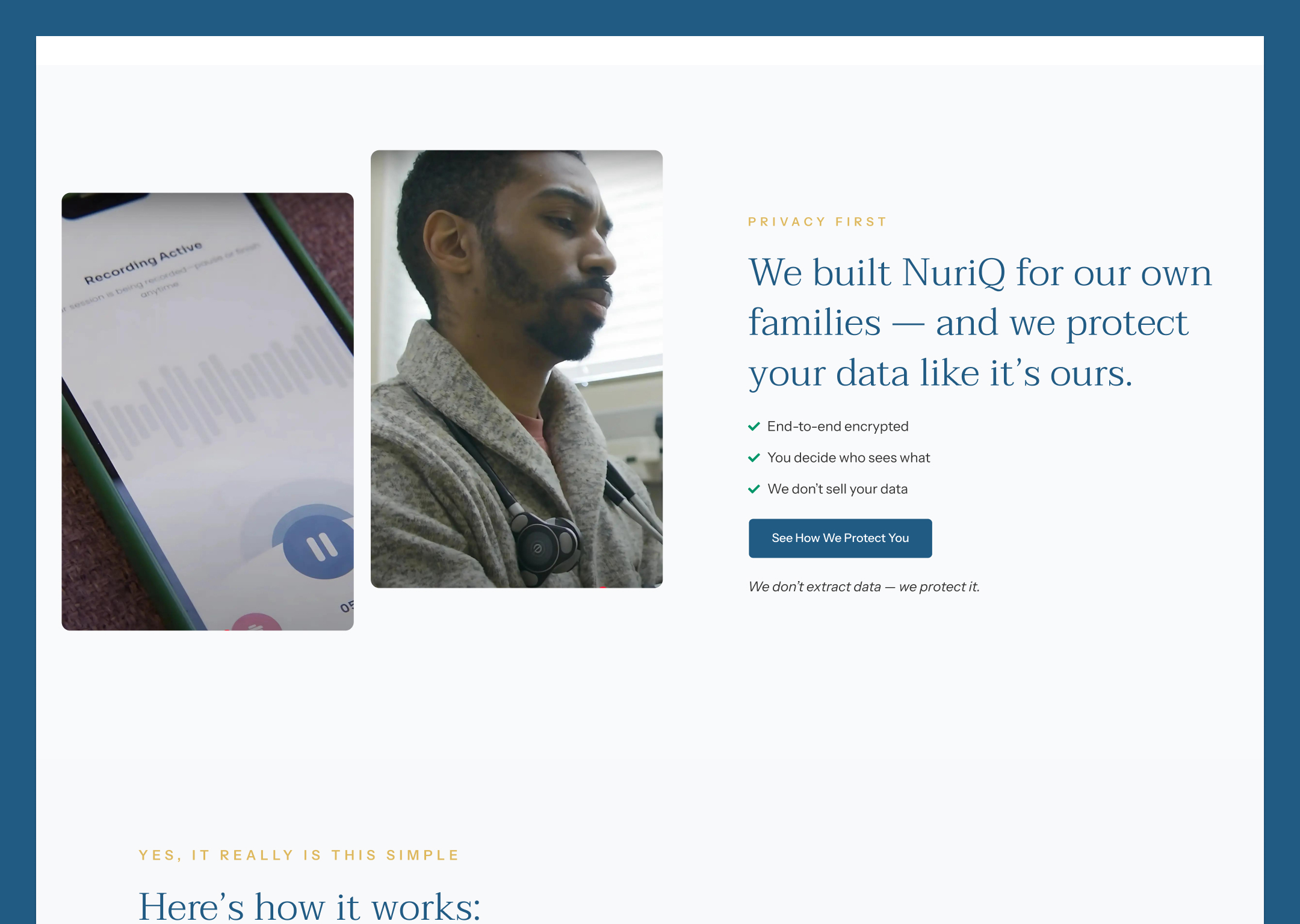
While the development role was copy-only, the design provided the essential, non-distracting container for the content strategy. The design expectations were explicitly clear: functionality over flair.

  • Minimalist Aesthetic: The core design strategy was ultra-clean and simple. The primary palette relied heavily on white space and high contrast (dark blue text on white background), ensuring that the minimal copy elements were the immediate, non-negotiable focal point for the user.
  • Color Strategy: A restrained palette of calming blues and warm, muted golds (Image 215707.jpg) was used strategically for headers and backgrounds to denote quality and trust without becoming distracting, perfectly complementing the authoritative tone of the copy.
  • Visual Hierarchy and Scannability: The design used clear, deliberate visual hierarchy to support the two-minute reading goal. Content was broken into simple, numbered steps (Image 215653.png), large, clear call-out boxes (Image 215628.png), and easily digestible lists, ensuring the user could scan the page and grasp the full value proposition instantly.
  • Authentic Imagery: Imagery, such as the doctor-patient interaction (Image 215621.jpg) and user interface screenshots, was used to visually reinforce the copy's message of empathy and simplicity, always keeping the focus on real-world use and care.

Through this disciplined approach, we leveraged the simplicity of the design to amplify the impact of our concise, high-conversion content.

Website
https://mynuriq.com/
View all