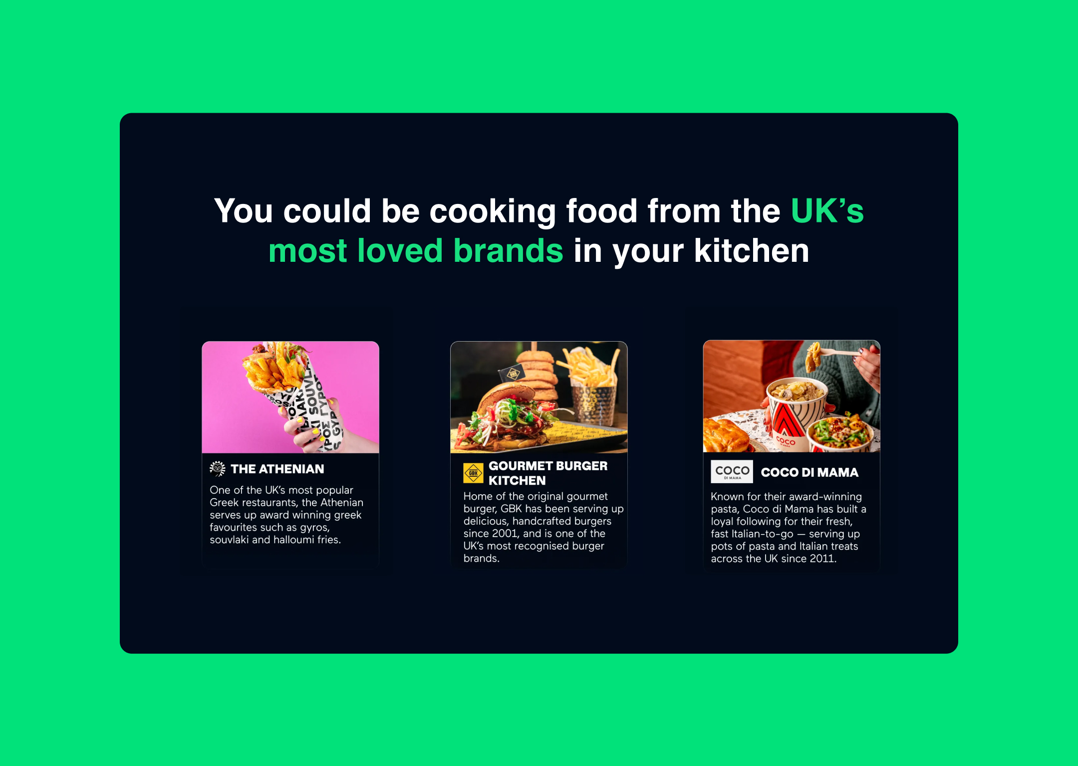
Growth Kitchen is a UK-based food technology platform that connects established restaurant brands with professional commercial kitchens, enabling nationwide expansion without the traditional costs and risks of opening physical locations. Operating across 130+ host kitchens, they deploy popular brands like Coqfighter, The Athenian, and Beer + Burger through delivery platforms, bringing quality restaurant food to underserved communities across the UK.
To create a dual-audience digital platform that clearly communicates Growth Kitchen's complex business model to two distinct groups: restaurant brands seeking expansion and kitchen operators looking for revenue growth. The goal was to establish a professional, data-driven online presence that simplified a sophisticated franchise model, built immediate trust through proof points, and created clear conversion pathways for both audiences—all while positioning Growth Kitchen as the intelligent solution to the limitations of traditional restaurant expansion.
The project began with extensive market research into the UK food delivery landscape and the ghost kitchen model. We identified a critical insight: both audiences were skeptical of virtual brand platforms due to quality concerns and unclear economics. This drove our strategy to lead with transparency, concrete financial data, and proof of quality maintenance. Every element of the site was designed to overcome objections before they formed and to position complexity as sophistication rather than confusion.
The content strategy was designed to highlight the benefits of utilizing existing kitchen space and staff to expand business opportunities. We focused on creating engaging narratives that resonate with restaurant owners looking for innovative ways to increase revenue.
We restructured the entire site architecture and messaging to serve two distinct audiences while maintaining brand coherence, leading with clarity and financial specificity.
Dual-Audience Architecture: We created two primary pathways—"Licence Brands" for host kitchens and "Restaurant Brands" for expansion-seeking restaurants. Each page was tailored to address the specific pain points, concerns, and motivations of its audience, ensuring neither group encountered irrelevant information that would increase cognitive load.
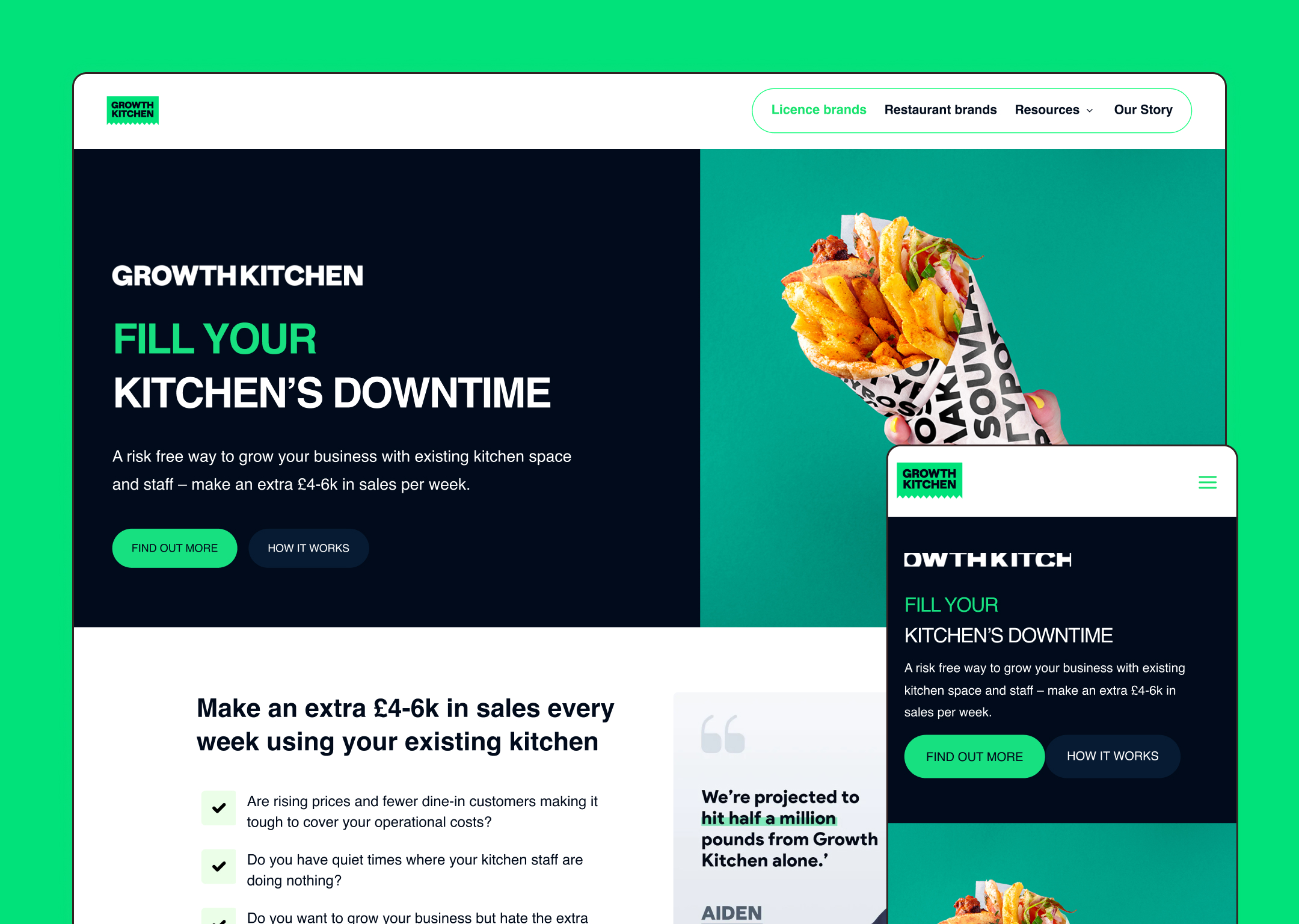
Tone and Language: The content voice was defined as Professional, Transparent, and Results-Driven. We deliberately avoided the typical startup hyperbole, opting instead for a grounded, data-forward tone that treated both audiences as sophisticated business operators. Phrases like "Fill Your Kitchen's Downtime" and "Grow Your Restaurant Brand with Less Risk" were crafted to immediately communicate practical value without overselling.
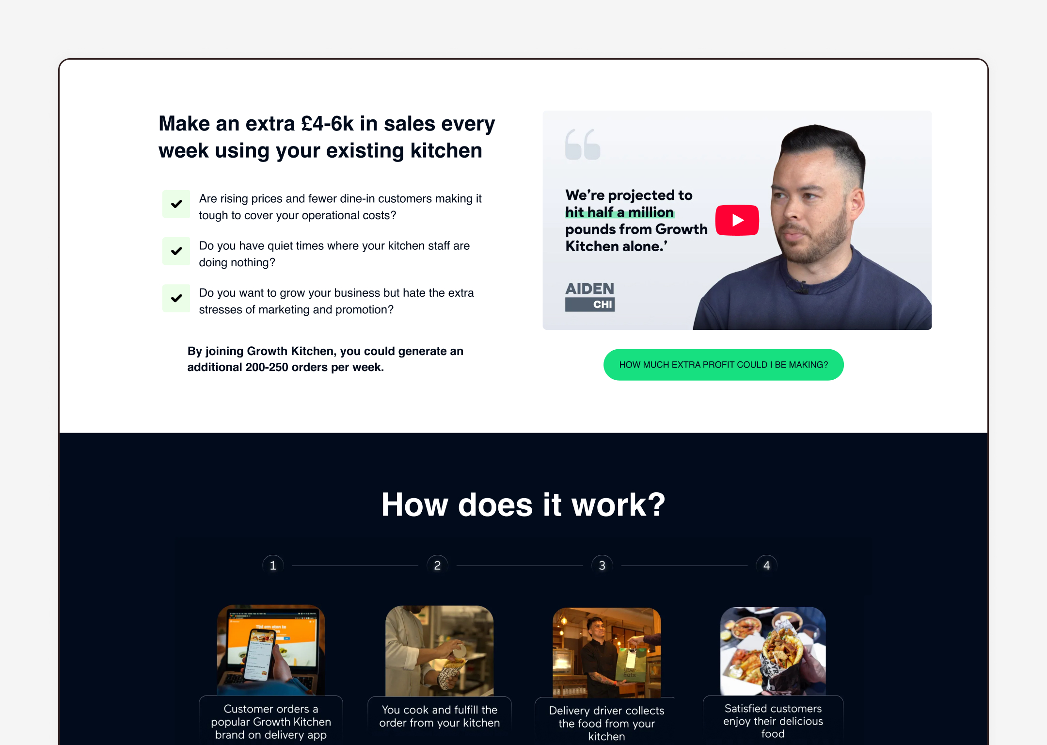
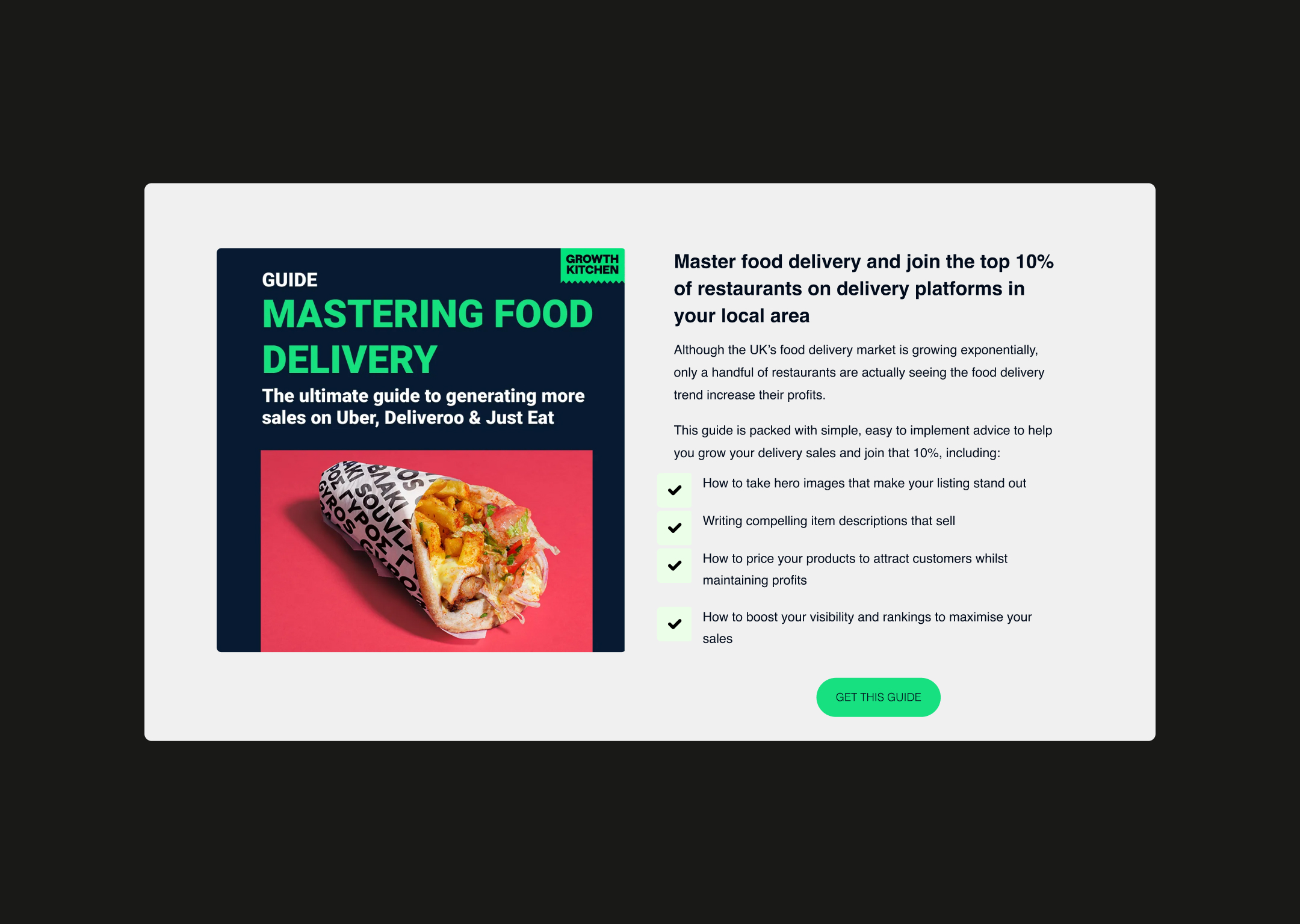
Financial Transparency as Trust Builder: Rather than hiding the economics, we made them the centerpiece. Copy explicitly stated "Make an extra £4-6k in sales per week" and broke down profit margins (18-20%), timeline to profitability (£2,000+ by week 4), and upfront costs (£900 for initial stock). This radical transparency was strategic—it pre-qualified leads and built trust by demonstrating Growth Kitchen had nothing to hide.
Objection-Based Content Structure: We anticipated and addressed every objection within the copy flow. Concerns about food quality? "Our partner brands' food is high-quality yet easy to prepare using simple ingredients." Worried about complexity? "Get set up in as little as 3 weeks." Skeptical about demand? "Yes. We are careful to only partner with well established brands that have large followings and a strong brand name." The FAQ section was strategically placed to capture late-stage decision-making concerns.
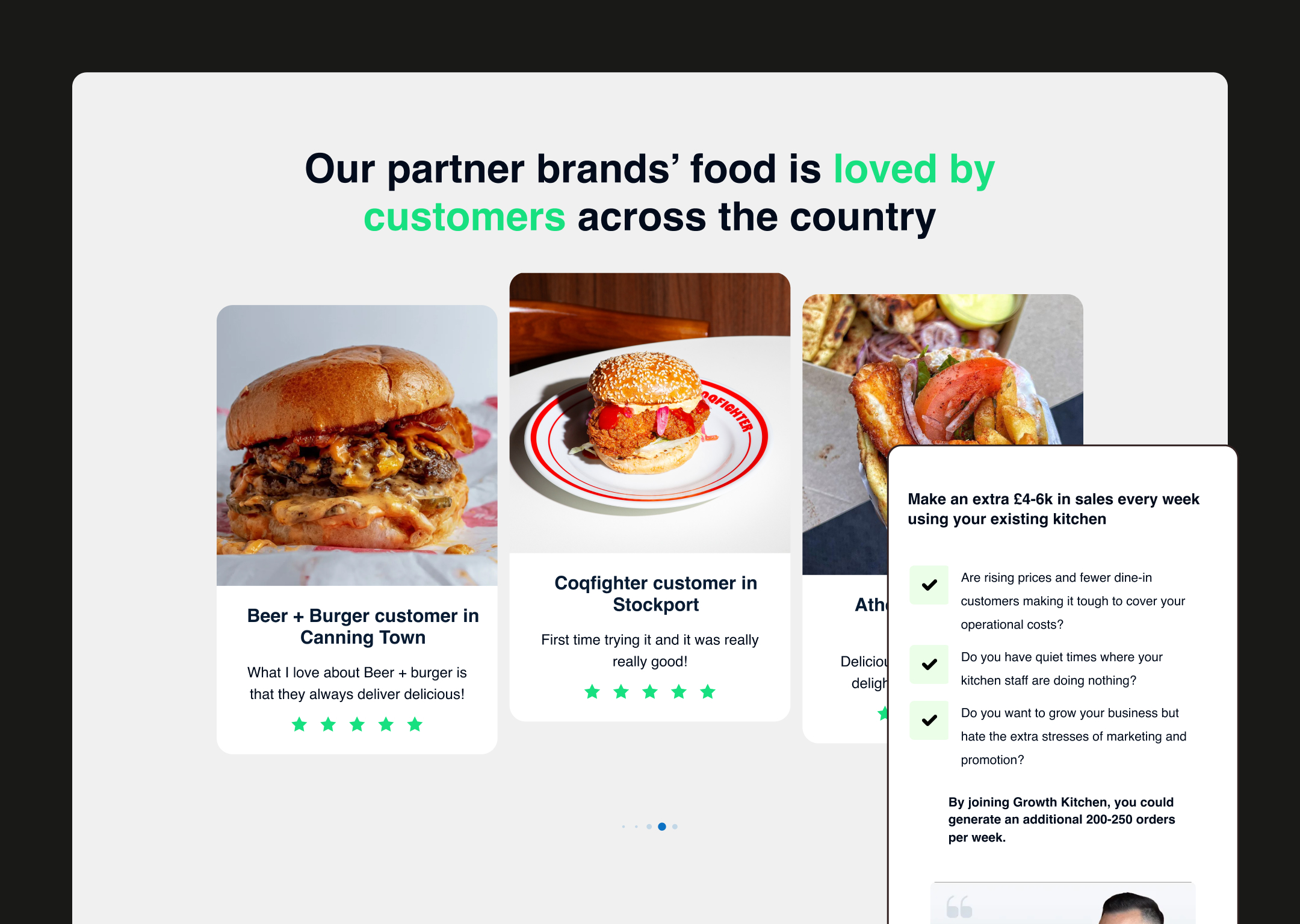
Social Proof Strategy: We wove proof throughout the narrative—customer testimonials with specific location data, partner brand logos (recognizable UK names), and real operator quotes with attribution. The testimonial "We launched in late September and had 10 orders come through on our first day. We recently had our highest ever week, reaching £8,000 in sales" was particularly powerful because it showed progression and real numbers.
Value Proposition Clarity: For restaurant brands, we framed the opportunity around a specific problem: "Traditionally, people in smaller cities and towns have had limited food options... there is ±30 million people who are currently looking for more food options." For host kitchens, we led with idle capacity: "Do you have quiet times where your kitchen staff are doing nothing?" This problem-first approach made the solution feel inevitable.
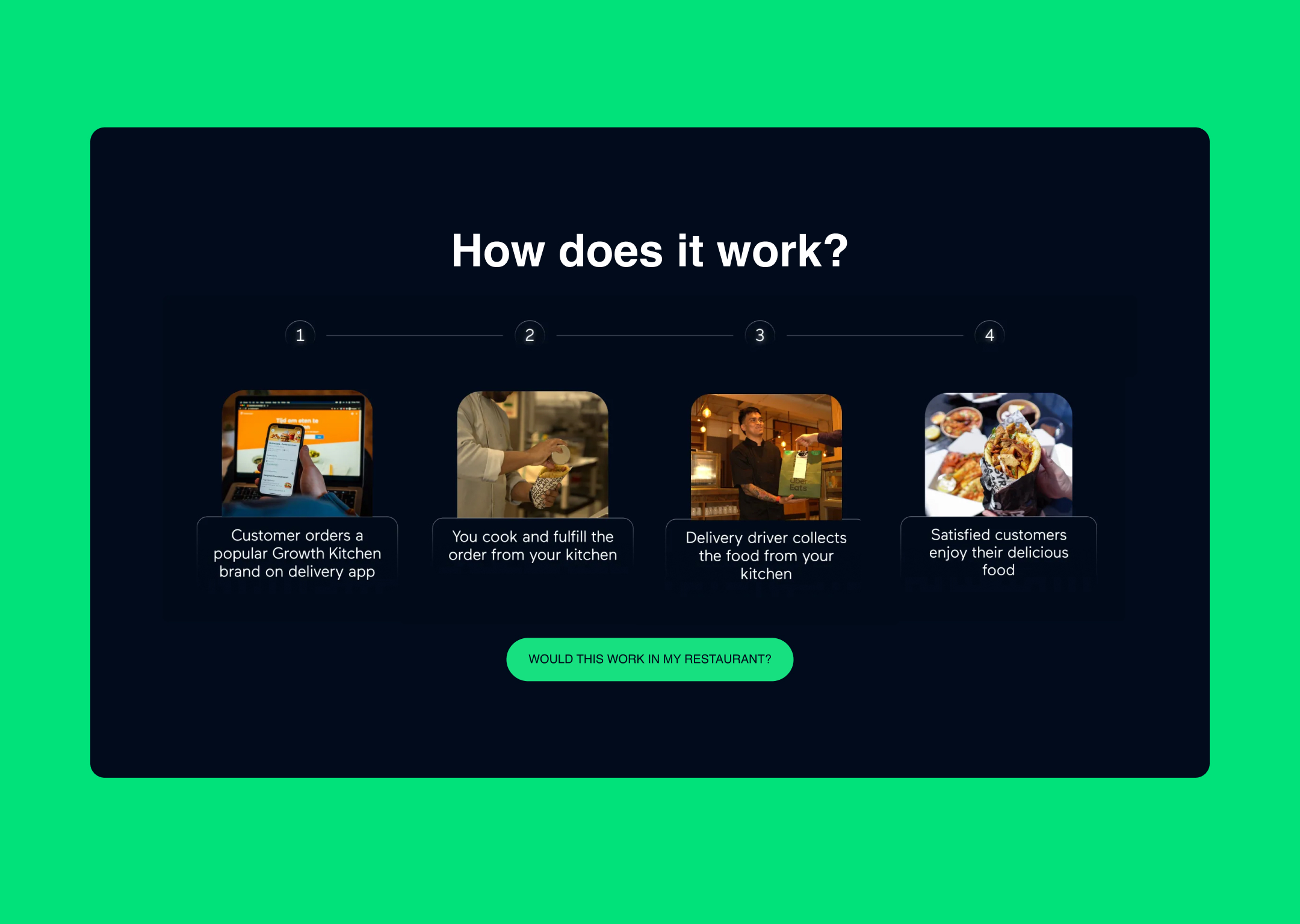
Process Simplification: Complex operational processes were distilled into clear, numbered steps. The three-step onboarding (Suitability Evaluation → Training & Launch → Optimize, Grow and Profit) made what could seem overwhelming feel manageable and linear.
The design was executed to visually reinforce Growth Kitchen's position as a sophisticated, data-driven platform while maintaining accessibility for busy restaurant operators.
Clean, Data-Forward Aesthetic: The visual approach was modern, professional, and uncluttered. We used a palette dominated by whites and warm neutrals with strategic pops of brand color to maintain a serious, business-focused environment. This wasn't a flashy consumer brand—it was a B2B platform built for operators who needed to see the numbers clearly.
Visual Hierarchy for Dual Audiences: The homepage immediately offered clear pathways through prominent navigation: "Licence Brands" and "Restaurant Brands" were given equal visual weight, ensuring neither audience felt like an afterthought. This bifurcation continued throughout the site architecture.
Trust-Building Visual Elements: We incorporated real brand logos prominently (Coqfighter, The Athenian, Beer + Burger), delivery platform badges (Uber Eats, Deliveroo, Just Eat), and location maps showing Growth Kitchen's UK-wide presence. These weren't decorative—they were strategic trust signals that communicated scale and legitimacy.
Information Density Management: Given the complexity of the business model, we used ample white space, clear section breaks, and visual cards to prevent information overload. Key statistics were given prominent placement in large, scannable typography: "130+ High quality kitchen operators," "4.6+ Avg. rating," "200-250 orders per week."
Calculator and Interactive Elements: We recommended interactive elements like the profit calculator to engage users and personalize the value proposition. This transformed passive reading into active exploration, increasing time on site and conversion likelihood.
Mobile Optimization: Recognizing that many restaurant operators would be evaluating the platform on mobile during downtime, we ensured the design was fully responsive with thumb-friendly CTAs and easily digestible content blocks that didn't require excessive scrolling or zooming.
CTA Strategy and Placement: Conversion points were strategically placed throughout the user journey—"Find Out More," "Book a Call to Unlock Profits," "Next Steps"—without being aggressive. Each CTA was contextually appropriate to the section it appeared in, creating a natural flow toward conversion.
Photography Direction: We emphasized authentic operational imagery—real kitchen environments, actual food preparation, delivery in action—rather than sterile stock photography. This grounded the platform in reality and made the business model tangible rather than abstract.
Through this transparent, data-driven content strategy and professional design approach, we successfully positioned Growth Kitchen as the intelligent infrastructure layer for UK food delivery expansion. The result is a digital platform that doesn't just inform both audiences—it educates, builds confidence, and converts by treating complexity as an asset and transparency as competitive advantage.