I've spent my career designing across continents, winning awards, and building brands that resonate globally. And I can tell you the secret to every single success I’ve ever had, whether it was a logo, a product interface, or an entire digital experience: simplicity is not the goal; it is the prerequisite.
People often mistake simple for easy. They think simple design means minimal effort. They could not be more wrong. Simplicity is the hardest brief you will ever receive, because it demands ruthless clarity and the absolute rejection of noise.
The Designer’s Core Problem: Cognitive Overload
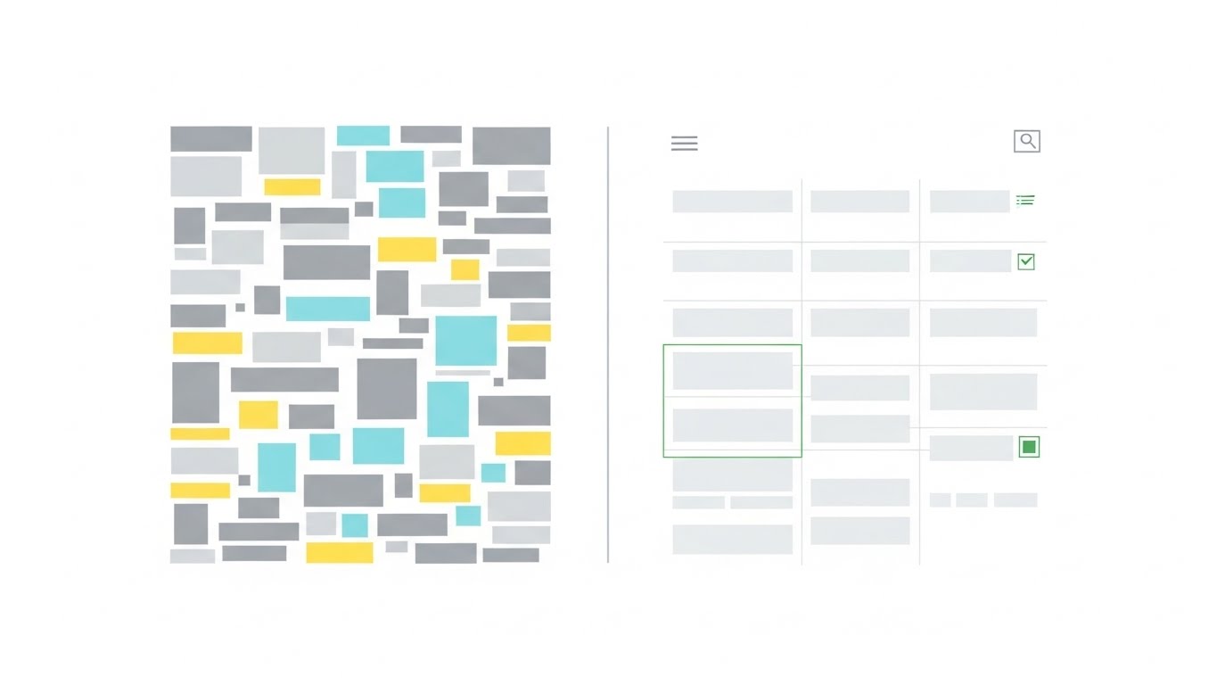
Look at the human brain. It is an evolutionary machine, wired to conserve energy. When you present someone with a design, a website, a user interface, a physical product, the brain immediately begins calculating the required effort to understand it.
If a design is cluttered, if it uses too many fonts, too many colors, too many buttons, or too much jargon, the brain registers cognitive overload. The user has to expend too much mental energy just to find the main idea. What does the brain do then? It tunes out. It saves those calories.
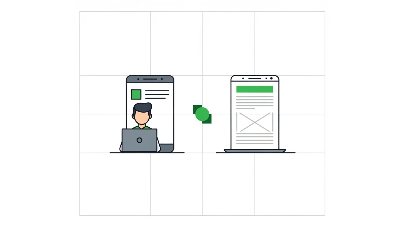
My approach, and the philosophy we champion at 3leaves Digital, is rooted in the pursuit of effortless understanding. We aim for designs where the function is immediately clear and the aesthetic is clean, allowing the user to dedicate their mental resources to the message, not the interface.
The Designer’s Core Problem: Cognitive Overload
Look at the human brain. It is an evolutionary machine, wired to conserve energy. When you present someone with a design, a website, a user interface, a physical product, the brain immediately begins calculating the required effort to understand it.
If a design is cluttered, if it uses too many fonts, too many colors, too many buttons, or too much jargon, the brain registers cognitive overload. The user has to expend too much mental energy just to find the main idea. What does the brain do then? It tunes out. It saves those calories.
My approach, and the philosophy we champion at 3leaves Digital, is rooted in the pursuit of effortless understanding. We aim for designs where the function is immediately clear and the aesthetic is clean, allowing the user to dedicate their mental resources to the message, not the interface.
Why Simple Design Makes People Feel Smarter
When a design is simple yet effective, the user does not feel confused or overwhelmed. Instead, they feel competent.
When you pick up a remote control and immediately know which button to press, you feel smart. When you navigate a website and find exactly what you need in two clicks, you feel efficient. This feeling of competence creates a positive emotional connection to the product or brand.
My work at 3leaves is focused on delivering this feeling. For our clients, that means:
- Laser-Focused Hierarchy: We use typography, spacing, and color to tell the user exactly where to look first, second, and third. There are no competing points of interest.
- Clear Calls to Action: The user never has to guess what to do next. The path to conversion or information is always a brightly lit superhighway, not a dark, confusing maze.
- Visual Economy: We select colors, textures, and iconography not just for beauty, but for communication. Every visual cue carries meaning, preventing the clutter of irrelevant decoration.
In the end, simplicity is the ultimate expression of confidence. It tells the user: "We know exactly who we are, we know exactly what we offer, and we respect your time."
That respect is why a simple, powerful design is not just good aesthetics, but the sharpest business strategy th